[Android] 控制 Selector 狀態,以 checked 為例
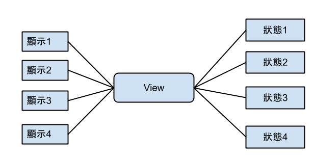
基本上selector是為了處理不同狀態有不同的顯示
 先來介紹基本的selector的用法(以下是參考
http://www.mkyong.com/android/android-imagebutton-selector-example/ 這篇大大寫的)
使用時機 : 基本上Android 有很多狀態,例如 select , check , pressed , focused ,等等狀態,如果都要用程式來控制這些狀態的UI顯示,那麼對程式的控制和可讀性就會變差,最好的方式就是透過"selector"
1. 準備各種狀態的素材
- button_normal_green.png – 一般狀態的圖示
- button_focused_orange.png – 取得焦點後的圖示
- button_pressed_yellow.png – 按下時的圖示
2. 定義各種狀態對應不同圖檔之設定檔
在 “res/drawable/” 目錄下, 創建 “
new_button.xml“. 這個名稱,將會變成系統的資源 : @drawable/new_button.
File : res/drawable/new_button.xml
version="1.0" encoding="utf-8"?>
xmlns:android="http://schemas.android.com/apk/res/android">
- android:drawable="@drawable/button_pressed_yellow"
android:state_pressed="true" />
- android:drawable="@drawable/button_focused_orange"
android:state_focused="true" />
- android:drawable="@drawable/button_normal_green" />
3. 設定Layout 檔
創建UI layout檔案 “res/layout/main.xml” ,特別注意“
android:background="@drawable/new_button”,這裡的背景是抓取剛才創立的設定檔
File : res/layout/main.xml
 version="1.0" encoding="utf-8"?>
 xmlns:android="http://schemas.android.com/apk/res/android"
    android:layout_width="fill_parent"
    android:layout_height="fill_parent"
    android:orientation="vertical" >


        android:id="@+id/imageButtonSelector"
        android:layout_width="wrap_content"
        android:layout_height="wrap_content"
        android:background="@drawable/new_button" />
4. Demo 的主程式
File : MyAndroidAppActivity.java
package com.mkyong.android;

import android.app.Activity;
import android.os.Bundle;
import android.widget.Button;
import android.widget.Toast;
import android.view.View;
import android.view.View.OnClickListener;

public class MyAndroidAppActivity extends Activity {

 Button imageButton;

 @Override
 public void onCreate(Bundle savedInstanceState) {
  super.onCreate(savedInstanceState);
  setContentView(R.layout.main);

  addListenerOnButton();

 }

 public void addListenerOnButton() {

  imageButton = (Button) findViewById(R.id.imageButtonSelector);

  imageButton.setOnClickListener(new OnClickListener() {

   @Override
   public void onClick(View arg0) {

    Toast.makeText(MyAndroidAppActivity.this,
     "ImageButton (selector) is clicked!",
     Toast.LENGTH_SHORT).show();

   }

  });

 }

}
5. Demo
1. 一般狀態

2. 取得焦點時

3. 按下按鈕時

接下來就是這次的重點,自訂義系統狀態
用的時機 : 有時候我們客製化一個View時,需要一些自訂義的狀態,那這麼辦,例如單選等等,娜以單選為例,用Android 預設的 Radiogroup來說,裡面只有放Radiobutton,才會有單選的效果,那麼要做自己客製化的View卻要有單選的效果,但又想用Selector,就要使用以下的方法
1 layout 檔的部分
<com.kw.moneymoney.ui.main.DateLevelGroup
            android:id="@+id/datelevelgroup"
            android:layout_width="fill_parent"
            android:layout_height="wrap_content"
            android:orientation="horizontal" >

            <com.kw.moneymoney.ui.main.DateLevelRadio
                android:id="@+id/daylevel"
                android:layout_width="wrap_content"
                android:layout_height="wrap_content"
                android:layout_gravity="left"
                android:layout_weight="1"
                android:background="@drawable/date_level_selector"
                android:orientation="vertical"
                myapp:textTitle="本日" >
            </com.kw.moneymoney.ui.main.DateLevelRadio>

            <com.kw.moneymoney.ui.main.DateLevelRadio
                 android:id="@+id/weeklevel"
                android:layout_width="wrap_content"
                android:layout_height="wrap_content"
                android:layout_weight="1"
                android:background="@drawable/date_level_selector"
                android:gravity="center_horizontal"
                android:orientation="vertical"
                myapp:textTitle="本周" >
            </com.kw.moneymoney.ui.main.DateLevelRadio>

            <com.kw.moneymoney.ui.main.DateLevelRadio
                 android:id="@+id/monthlevel"
                android:layout_width="wrap_content"
                android:layout_height="wrap_content"
                android:layout_gravity="center"
                android:layout_weight="1"
                android:background="@drawable/date_level_selector"
                android:orientation="vertical"
                myapp:textTitle="本月" >
            </com.kw.moneymoney.ui.main.DateLevelRadio>
        </com.kw.moneymoney.ui.main.DateLevelGroup>
其中的 date_level_selector.xml 如下
xml version="1.0" encoding="utf-8"?>
<selector xmlns:android="http://schemas.android.com/apk/res/android">
    <item android:drawable="@color/radio_level_check" android:state_checked="true" />
    <item android:drawable="@drawable/index_main_top_border" android:state_checked="false" />
    <item android:drawable="@drawable/index_main_top_border"/>
</selector>
DateLevelRadio.java (類似 RadionButton)
public class DateLevelRadio extends LinearLayout implements Checkable {

 private static final int[] CheckedStateSet = { android.R.attr.state_checked, };
 private boolean mChecked = false;
 private TextView levelTitleView = null;
 private OnCheckedChangeListener onCheckedChangeListener;

 public DateLevelRadio(Context context, AttributeSet attrs) {
  super(context, attrs);
  init();
  TypedArray typedArray = context.obtainStyledAttributes(attrs,
    R.styleable.dateRadio);
  levelTitleView.setText(typedArray
    .getString(R.styleable.dateRadio_textTitle));
  typedArray.recycle();
 }

 public DateLevelRadio(Context context) {
  super(context);
  init();
 }

 private void init() {
  LayoutInflater mInflater = (LayoutInflater) getContext()
    .getSystemService(Context.LAYOUT_INFLATER_SERVICE);
  mInflater.inflate(R.layout.main_index_datelevel_layout, this);
  levelTitleView = (TextView) findViewById(R.id.showLevelTitle);
 }

 @Override
 public void setChecked(boolean checked) {
  mChecked = checked;
  if (onCheckedChangeListener != null)
   onCheckedChangeListener.onCheckedChanged(this, checked);

  refreshDrawableState();
 }

 @Override
 public boolean isChecked() {
  return mChecked;
 }

 @Override
 public void toggle() {
  setChecked(!mChecked);
 }

 @Override
 protected int[] onCreateDrawableState(int extraSpace) {
  final int[] drawableState = super.onCreateDrawableState(extraSpace + 1);
  if (isChecked()) {
   mergeDrawableStates(drawableState, CheckedStateSet);
  }
  return drawableState;
 }

 public OnCheckedChangeListener getOnCheckedChangeListener() {
  return onCheckedChangeListener;
 }

 public void setOnCheckedChangeListener(
   OnCheckedChangeListener onCheckedChangeListener) {
  this.onCheckedChangeListener = onCheckedChangeListener;
 }

 /**
  * Interface definition for a callback to be invoked when the checked state
  * of a compound button changed.
  */
 public static interface OnCheckedChangeListener {
  /**
   * Called when the checked state of a compound button has changed.
   *
   * @param buttonView
   *            The compound button view whose state has changed.
   * @param isChecked
   *            The new checked state of buttonView.
   */
  void onCheckedChanged(DateLevelRadio buttonView, boolean isChecked);
 }

}
這邊不要重要的如下
 @Override
 public void setChecked(boolean checked) {
  mChecked = checked;
  if (onCheckedChangeListener != null)
   onCheckedChangeListener.onCheckedChanged(this, checked);

  refreshDrawableState();
 }
當每次呼叫setChecked這個方法就會呼叫refreshDrawableState();這個方法,而這個方法就是
Android透過狀態去讀取selector的方法,當呼叫refreshDrawableState();,就會觸發
@Override protected int[] onCreateDrawableState(int extraSpace) { final int[] drawableState = super.onCreateDrawableState(extraSpace + 1); if (isChecked()) { mergeDrawableStates(drawableState, CheckedStateSet); } return drawableState; }[android]android attributeset 用法與時機
但是如果只回傳state_checked的狀態不就是原本view的狀態都會被蓋掉,還好android很貼心提供mergeDrawableStates(drawableState, CheckedStateSet);讓你可以跟原本的狀態做合併,回傳正確你的view 就會了 checked的狀態了


留言
張貼留言